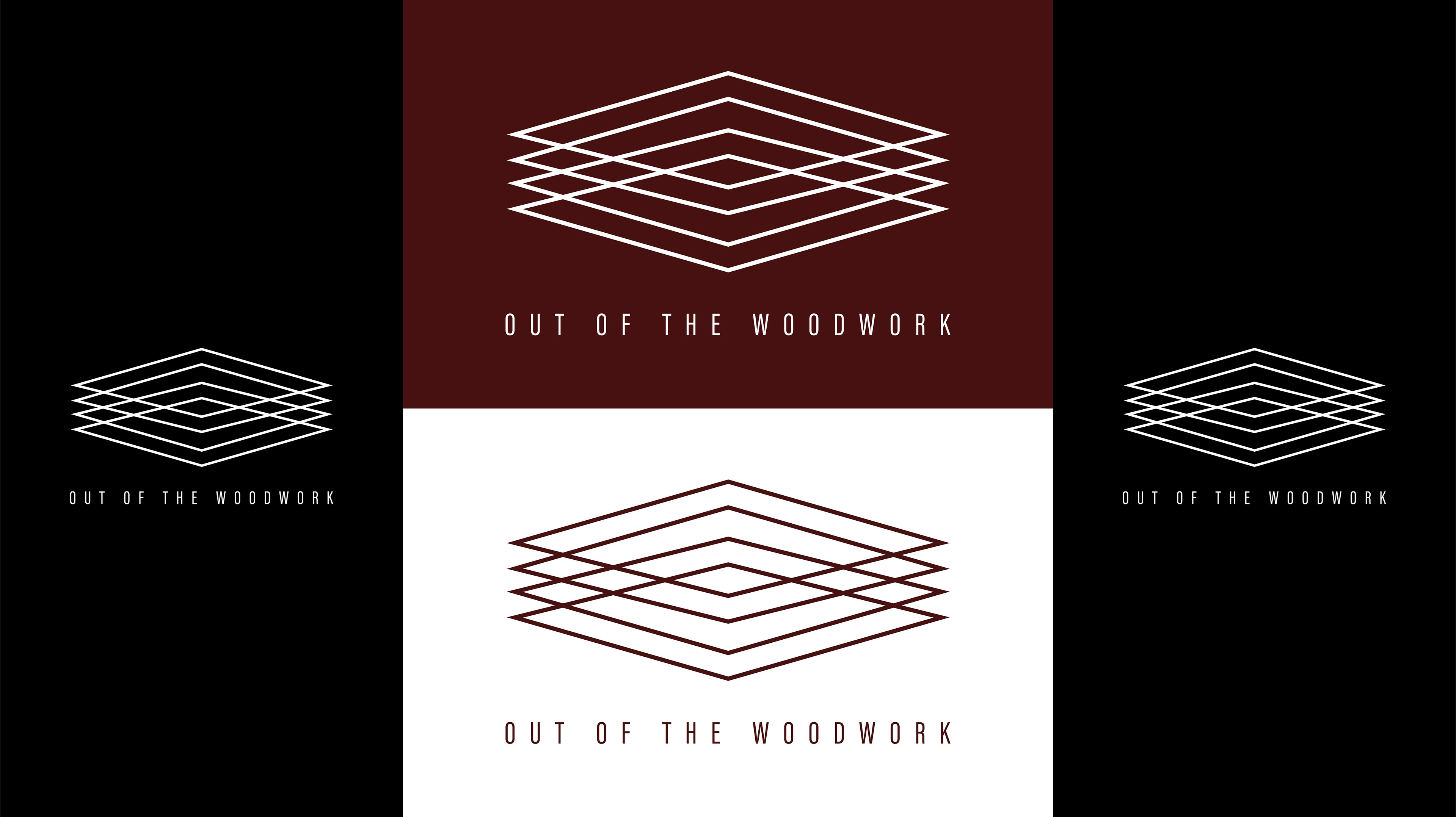
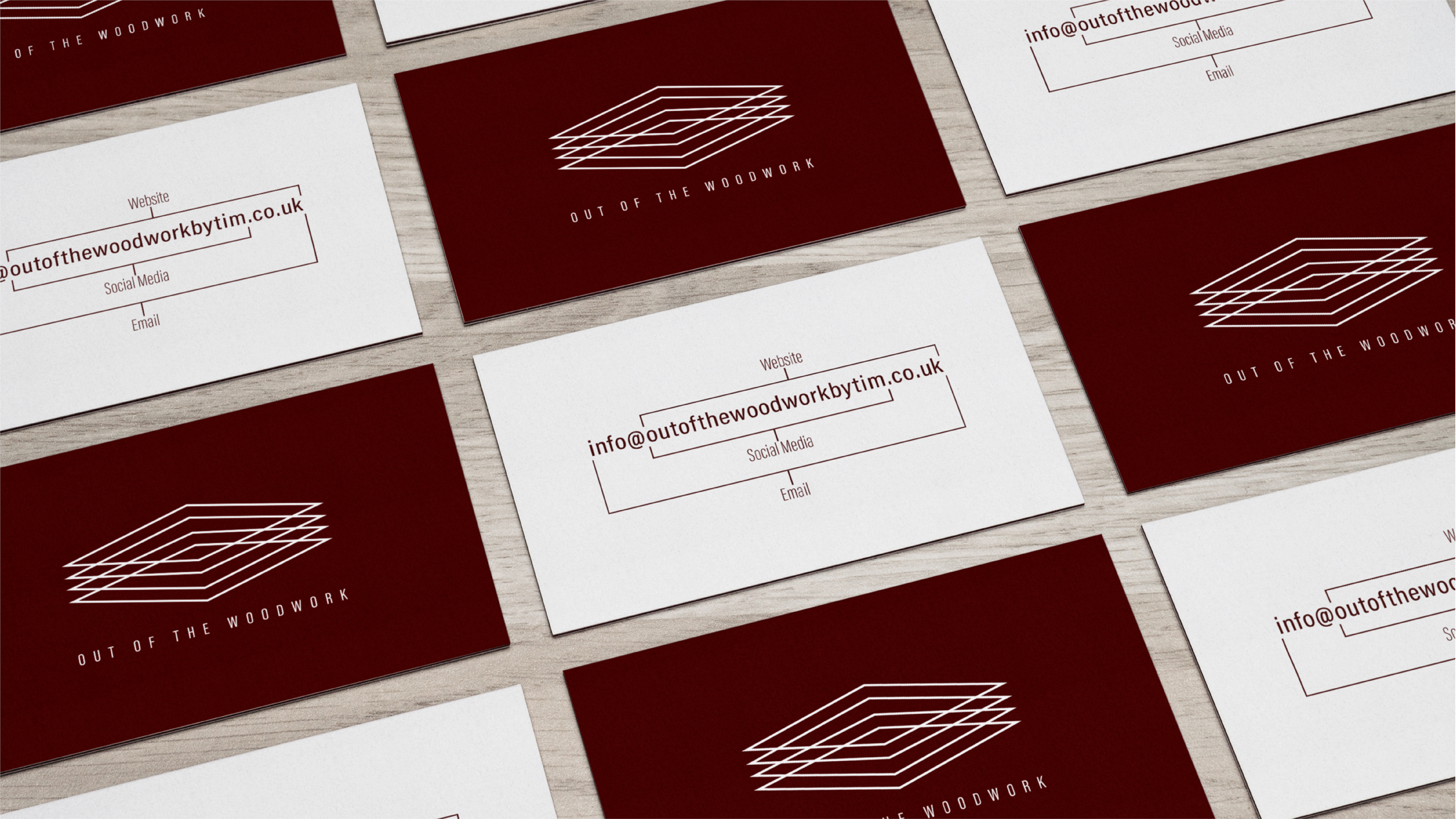
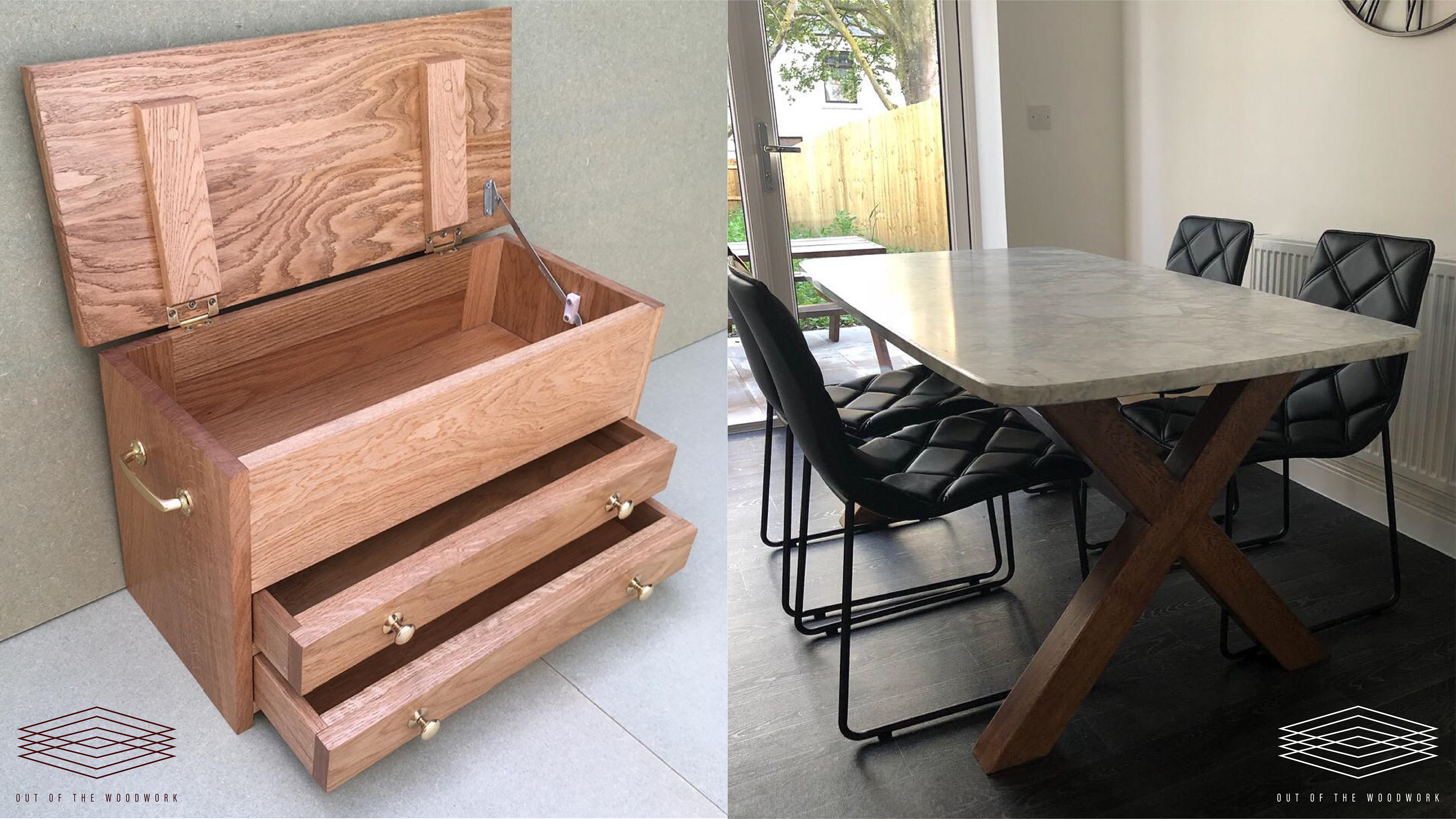
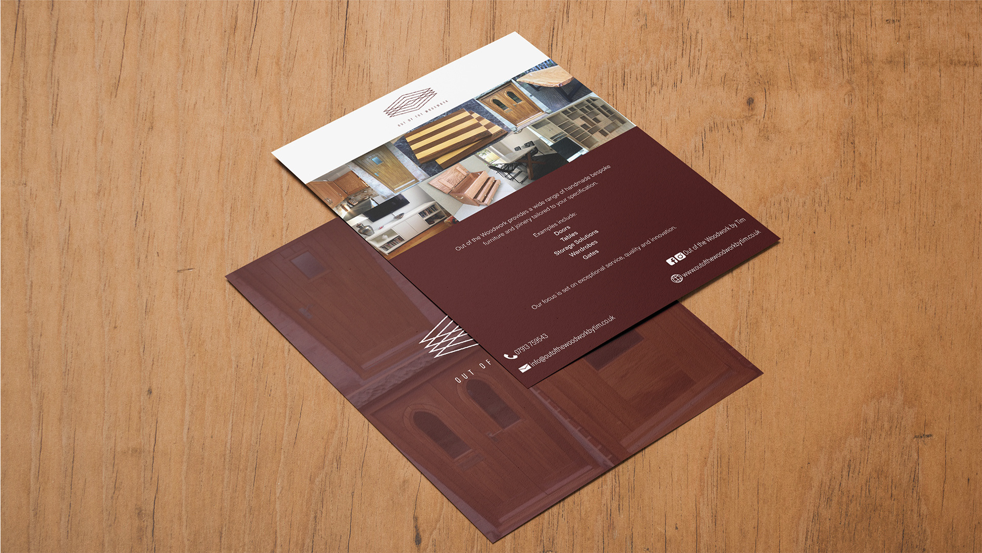
The client, Tim, is a joiner who provides bespoke designs for home furnishings. For his branding, he wanted something that would make his work stand out from the rest. During the research stages, while looking at his work, it was clear that he puts extra care and detail into his work. It is the precision and care that gives his products that extra bit of quality. So for his logo, it needed to be very professional, to reflect his work. In terms of colour, an oaky red was chosen, as plain brown didn't suggest quality, whereas this colour choice did. Also provided to Tim was print work (business cards, flyers), social media management, and an overall branding guide for his business.